· Tutorial · 13 min read
Gudie to Effective Visualization
Understand how to improve data visualization for effective communication.
Introduction
In the world of data science and analytics consulting, presenting data isn’t enough. We need to communicate insights effectively, driving understanding and decision-making for diverse client audiences. Cole Nussbaumer Knaflic’s “Storytelling with Data” provides a masterclass in the principles of transforming raw data into compelling visual narratives. While the book itself is tool-agnostic, its core lessons are invaluable for technical practitioners.
This post translates key concepts from “Storytelling with Data” into practical, sophisticated visualization techniques using Python’s matplotlib and numpy. We’ll move beyond basic charts, focusing on visualizations professional organizations use to engage stakeholders, highlight key findings, and tell clear, data-driven stories. We assume a working knowledge of Python and basic matplotlib.
Core Principles We’ll Embody:
- Context is King: Every visualization serves a specific purpose for a specific audience.
- Choose Appropriate Visuals: Select chart types that best represent the data and the message.
- Eliminate Clutter: Remove anything that doesn’t add value (chartjunk) to reduce cognitive load.
- Focus Attention: Use preattentive attributes (like color, size, position) strategically.
- Think Like a Designer: Embrace clarity, accessibility, and aesthetics.
- Tell a Story: Structure your visuals and narrative logically.
Let’s dive into some techniques.
import matplotlib.pyplot as plt
import numpy as np
import matplotlib.ticker as mticker

# Consistent styling for professionalism
plt.style.use('seaborn-v0_8-whitegrid')
plt.rcParams['font.family'] = 'sans-serif' # Use a clean sans-serif font
plt.rcParams['font.sans-serif'] = ['Arial', 'DejaVu Sans', 'Liberation Sans']
plt.rcParams['axes.labelcolor'] = '#333333'
plt.rcParams['xtick.labelcolor'] = '#333333'
plt.rcParams['ytick.labelcolor'] = '#333333'
plt.rcParams['axes.titlecolor'] = '#333333'
plt.rcParams['figure.titlesize'] = 'large'
plt.rcParams['axes.titlesize'] = 'medium'
plt.rcParams['axes.labelsize'] = 'small'
plt.rcParams['xtick.labelsize'] = 'x-small'
plt.rcParams['ytick.labelsize'] = 'x-small'
1. Strategic Use of Simple Text
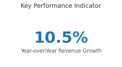
Purpose: When you have only one or two key numbers to convey, a graph can dilute their impact. Using large, prominent text ensures the core message is immediately understood.
Client Scenario: Presenting the single most crucial KPI outcome to an executive board – for instance, the year-over-year revenue growth percentage. They need the bottom line quickly.
Implementation (Illustrative Text Placement): While not strictly a plot, we can use matplotlib to place text effectively on a slide or figure.
# --- Technique 1: Simple Text Emphasis ---
np.random.seed(0)
yoy_growth = np.random.uniform(5.0, 15.0) # Example KPI

fig, ax = plt.subplots(figsize=(4, 2))

# Hide axes entirely for pure text display
ax.axis('off')

# Display the number prominently
ax.text(0.5, 0.6, f"{yoy_growth:.1f}%",
        fontsize=36, fontweight='bold', color='#1f77b4', # Emphasize with size, weight, color
        ha='center', va='center')

# Add context concisely
ax.text(0.5, 0.3, "Year-over-Year Revenue Growth",
        fontsize=12, color='#555555', ha='center', va='center')

plt.suptitle("Key Performance Indicator", fontsize=14, color='#333333', y=1.05)
plt.tight_layout()
plt.show()
Design Choices & Communication:
- Focus Attention: The sheer size and bold color of the number immediately draw the eye.
- Eliminate Clutter: No axes, gridlines, or unnecessary elements distract from the core message.
- Context: Minimal supporting text provides necessary context without overwhelming. This respects executive time by delivering the key takeaway instantly.
2. Ordered Horizontal Bar Chart
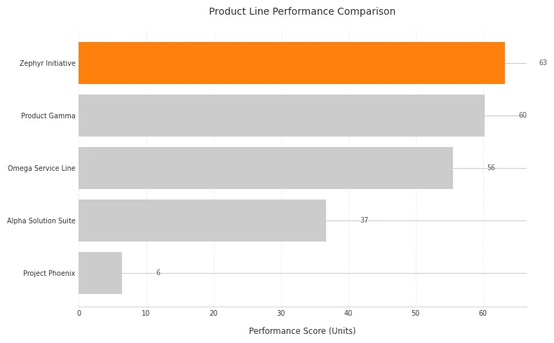
Purpose: Excellent for comparing magnitudes across discrete categories, especially when category labels are long. Ordering the bars makes comparisons effortless.
Client Scenario: Showing performance (e.g., customer satisfaction scores, sales volume) across different product lines or regions. The client needs to quickly identify top and bottom performers.
Implementation:
# --- Technique 2: Ordered Horizontal Bar Chart ---
np.random.seed(42)
categories = ['Product Gamma', 'Zephyr Initiative', 'Project Phoenix', 'Omega Service Line', 'Alpha Solution Suite']
values = np.random.randint(50, 150, size=len(categories)) * np.random.rand(len(categories))

# Sort data for logical ordering (essential for clarity)
sorted_indices = np.argsort(values)
sorted_categories = [categories[i] for i in sorted_indices]
sorted_values = values[sorted_indices]

fig, ax = plt.subplots(figsize=(8, 5))

# Base color and highlight color
base_color = '#cccccc' # Grey for context
highlight_color = '#ff7f0e' # Orange for focus (e.g., top performer)
colors = [base_color] * (len(sorted_categories) - 1) + [highlight_color]

bars = ax.barh(sorted_categories, sorted_values, color=colors)

# Declutter: Remove unnecessary spines and ticks
ax.spines['top'].set_visible(False)
ax.spines['right'].set_visible(False)
ax.spines['left'].set_visible(False) # Labels act as the 'axis'
ax.spines['bottom'].set_color('#dddddd')
ax.tick_params(bottom=False, left=False) # Remove ticks
ax.xaxis.grid(True, color='#eeeeee', linestyle='--') # Subtle vertical grid
ax.set_axisbelow(True) # Grid behind bars

# Add data labels for precise values (optional, consider audience need)
for bar in bars:
    width = bar.get_width()
    label_x_pos = width + 5 # Position label slightly outside bar
    ax.text(label_x_pos, bar.get_y() + bar.get_height()/2, f'{width:,.0f}',
            va='center', ha='left', fontsize='x-small', color='#555555')

ax.set_xlabel("Performance Score (Units)", labelpad=10) # Add context
ax.set_title("Product Line Performance Comparison", pad=15)
plt.tight_layout()
plt.show()
Design Choices & Communication:
- Logical Ordering: Sorting by value (descending or ascending) allows immediate identification of rank. This fulfills the principle of creating logical flow.
- Horizontal Orientation: Improves readability for potentially long category names (
barh). - Eliminate Clutter: Removing the left spine and y-ticks reduces visual noise, letting the labels and bars dominate. Subtle gridlines aid comparison without distraction.
- Focus Attention (Color): Using grey for most bars and a distinct color (like orange or blue) for the highest/lowest or a specific item of interest guides the viewer’s eye strategically.
- Data Labels: Adding precise values directly on/near bars removes the need for the audience to refer back to the x-axis for exact figures, if that precision is needed.
3. Line Chart with Focused Annotation
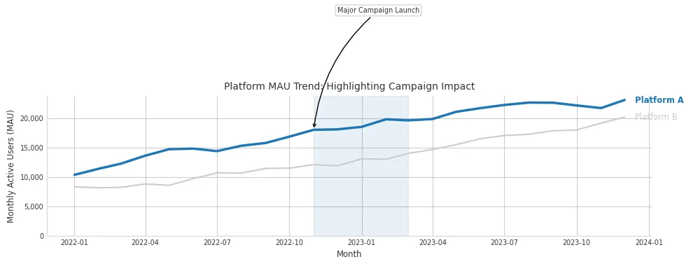
Purpose: Showing trends over continuous data (like time), while highlighting specific events, periods, or data series using color and text annotation.
Client Scenario: Tracking monthly active users (MAU) for a client’s platform and pointing out the impact of specific marketing campaigns or feature launches.
Implementation:
# --- Technique 3: Line Chart with Focused Annotation ---
np.random.seed(101)
months = np.arange('2022-01', '2024-01', dtype='datetime64[M]')
platform_a_mau = 10000 + np.cumsum(np.random.randint(-500, 1500, size=len(months)))
platform_b_mau = 8000 + np.cumsum(np.random.randint(-300, 1200, size=len(months)))

fig, ax = plt.subplots(figsize=(10, 5))

# Plot contextual data in grey
ax.plot(months, platform_b_mau, color='#cccccc', linewidth=1.5, label='Platform B (Context)')

# Plot focus data in a distinct color
ax.plot(months, platform_a_mau, color='#1f77b4', linewidth=2.5, label='Platform A (Focus)') # Blue focus

# Highlight a specific period or event with annotation
campaign_start_idx = 10
campaign_end_idx = 14
highlight_date = months[campaign_start_idx]
highlight_value = platform_a_mau[campaign_start_idx]

# Add annotation text
ax.annotate('Major Campaign Launch',
            xy=(highlight_date, highlight_value),
            xytext=(highlight_date + np.timedelta64(1, 'M'), highlight_value + 20000), # Position text away
            arrowprops=dict(facecolor='#333333', arrowstyle='->', connectionstyle='arc3,rad=.2'),
            fontsize='x-small', color='#333333',
            bbox=dict(boxstyle='round,pad=0.3', fc='white', ec='#cccccc', alpha=0.8))

# Optional: Shade a period
ax.axvspan(months[campaign_start_idx], months[campaign_end_idx], color='#1f77b4', alpha=0.1)

# Improve legibility and declutter
ax.spines['top'].set_visible(False)
ax.spines['right'].set_visible(False)
ax.spines['left'].set_color('#dddddd')
ax.spines['bottom'].set_color('#dddddd')
ax.yaxis.set_major_formatter(mticker.FuncFormatter(lambda x, p: format(int(x), ','))) # Comma separators for large numbers
ax.set_xlabel("Month")
ax.set_ylabel("Monthly Active Users (MAU)")
ax.set_title("Platform MAU Trend: Highlighting Campaign Impact")

# Subtle legend or direct labeling
# ax.legend(loc='upper left', fontsize='x-small', frameon=False)
# Direct Labeling Example:
ax.text(months[-1] + np.timedelta64(10, 'D'), platform_a_mau[-1], ' Platform A', color='#1f77b4', va='center', fontsize='small', fontweight='bold')
ax.text(months[-1] + np.timedelta64(10, 'D'), platform_b_mau[-1], ' Platform B', color='#cccccc', va='center', fontsize='small')


plt.ylim(bottom=0) # Ensure y-axis starts at 0 for MAU
plt.tight_layout()
plt.show()
Design Choices & Communication:
- Focus Attention (Color & Weight): The focus line (Platform A) uses a stronger color and slightly thicker weight. Contextual data (Platform B) is muted in grey.
- Annotation for Storytelling: The
ax.annotatecall explicitly points out a key event (“Major Campaign Launch”), guiding interpretation. The shaded region (axvspan) visually delineates the campaign period. - Decluttering: Cleaned spines and improved y-axis formatting (
FuncFormatterfor commas) enhance readability. - Labeling: Direct labels (added via
ax.textnear the line ends) are often preferable to a separate legend, reducing the back-and-forth eye movement Knaflic advises against.
4. Carefully Designed Stacked Bar Chart
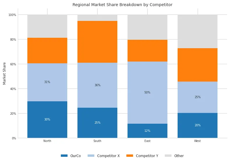 Purpose: Comparing part-to-whole relationships across multiple categories or time periods. Stacked bars show both the total and the contribution of individual components. Use with caution, as comparing segments not on the baseline is difficult.
Client Scenario: Displaying market share breakdown by different competitors across several geographic regions. The client wants to see both total market size per region and each competitor’s share.
Implementation:
# --- Technique 4: Stacked Bar Chart ---
np.random.seed(123)
regions = ['North', 'South', 'East', 'West']
competitors = ['OurCo', 'Competitor X', 'Competitor Y', 'Other']
data = np.random.rand(len(competitors), len(regions)) * 100
data /= data.sum(axis=0) # Normalize to percentages for each region
data *= 100 # Back to percentages

fig, ax = plt.subplots(figsize=(8, 6))

# Colors - avoid rainbow. Use distinct but related or sequential colors.
# Example: Use different shades of a brand color, or a standard palette
colors = ['#1f77b4', '#aec7e8', '#ff7f0e', '#dddddd'] # Blue focus, light blue, orange, grey

bottoms = np.zeros(len(regions))
bars_list = [] # To hold bars for labeling

for i, competitor in enumerate(competitors):
    bars = ax.bar(regions, data[i], bottom=bottoms, label=competitor, color=colors[i])
    bars_list.append(bars)
    bottoms += data[i]

# Add labels inside bars if space allows (can get cluttered)
# Optional - for clarity, especially with few segments
for i, bars in enumerate(bars_list):
     if i < 2: # Only label larger segments maybe?
        for bar in bars:
            height = bar.get_height()
            if height > 7: # Threshold for labeling
                ax.text(bar.get_x() + bar.get_width()/2,
                        bar.get_y() + height/2,
                        f'{height:.0f}%',
                        ha='center', va='center',
                        fontsize='x-small', color='white' if i==0 else '#333333') # White on dark

# Decluttering and Aesthetics
ax.spines['top'].set_visible(False)
ax.spines['right'].set_visible(False)
ax.spines['left'].set_color('#dddddd')
ax.spines['bottom'].set_color('#dddddd')
ax.tick_params(axis='x', length=0) # Remove x-axis ticks
ax.yaxis.set_major_formatter(mticker.PercentFormatter(xmax=100))
ax.set_ylabel("Market Share")
ax.set_title("Regional Market Share Breakdown by Competitor")

# Legend - place thoughtfully
ax.legend(loc='upper center', bbox_to_anchor=(0.5, -0.1), ncol=len(competitors), frameon=False, fontsize='small')

plt.tight_layout(rect=[0, 0, 1, 0.95]) # Adjust layout to prevent title overlap
plt.show()
Design Choices & Communication:
- Part-to-Whole: The stacked structure naturally conveys the total (100% in this normalized case) and component shares for each region.
- Color Strategy: Uses distinct colors but avoids a confusing “rainbow effect”. Highlights ‘OurCo’ with a primary color. Grey is used for the ‘Other’ category, pushing it to the background.
- Baseline Challenge: Explicitly acknowledge (perhaps in accompanying text/narration) that comparing segments not on the baseline (like Competitor X vs Competitor Y’s share between regions) is visually challenging. The design focuses on comparing the primary segment (‘OurCo’) easily, as it’s on the baseline.
- Labeling: Judicious labeling inside segments can add precision but risks clutter. Placing the legend below provides clarity without overlapping the chart area.
5. Scatter Plot with Quadrants and Annotations
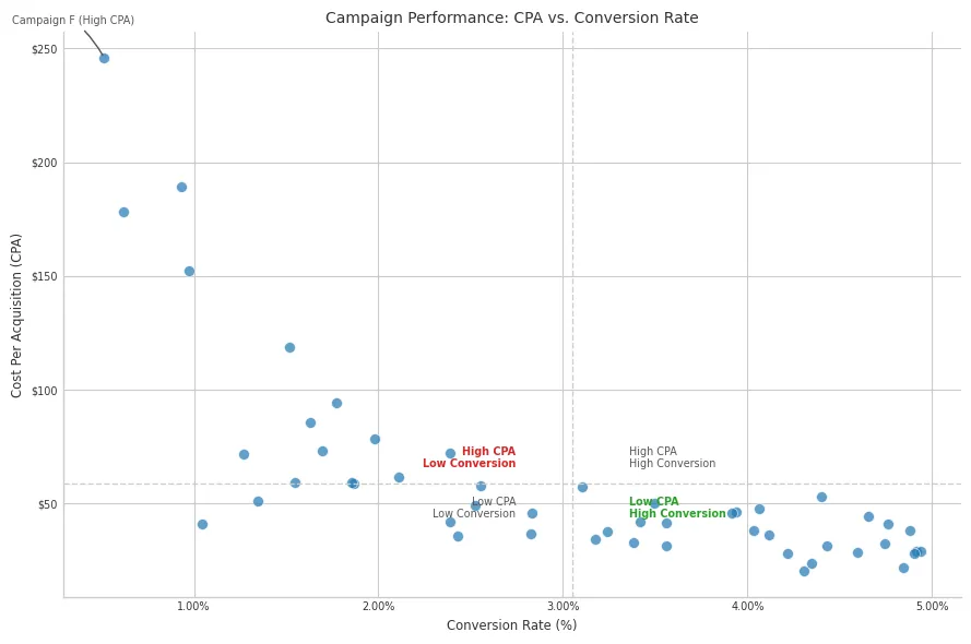
Purpose: Investigating the relationship between two quantitative variables, identifying correlations, clusters, and outliers. Adding quadrants or annotations provides further context.
Client Scenario: Evaluating advertising campaigns by plotting Cost per Acquisition (CPA) against Conversion Rate. The client wants to identify high-performing (low CPA, high conversion) and problematic campaigns.
Implementation:
# --- Technique 5: Scatter Plot with Quadrants ---
np.random.seed(200)
num_campaigns = 50
conversion_rate = np.random.uniform(0.5, 5.0, size=num_campaigns) # In percent
# CPA inversely related to conversion rate, with noise
cpa = 100 / conversion_rate * np.random.normal(1, 0.3, size=num_campaigns) + np.random.uniform(0, 20, size=num_campaigns)
campaign_names = [f'Campaign {chr(65+i)}' for i in range(num_campaigns)]

# Calculate averages for quadrant lines
avg_conversion = np.mean(conversion_rate)
avg_cpa = np.mean(cpa)

fig, ax = plt.subplots(figsize=(9, 6))

# Plot data points - Use alpha for dense plots
ax.scatter(conversion_rate, cpa, alpha=0.7, color='#1f77b4', s=50, edgecolors='#ffffff', linewidths=0.5) # Size, transparency

# Add quadrant lines based on averages
ax.axhline(avg_cpa, color='#cccccc', linestyle='--', linewidth=1)
ax.axvline(avg_conversion, color='#cccccc', linestyle='--', linewidth=1)

# Annotate quadrants
ax.text(avg_conversion * 1.1, avg_cpa * 1.1, 'High CPA\nHigh Conversion', fontsize='x-small', color='#555555', va='bottom', ha='left')
ax.text(avg_conversion * 0.9, avg_cpa * 1.1, 'High CPA\nLow Conversion', fontsize='x-small', color='#d62728', va='bottom', ha='right', fontweight='bold') # Problem
ax.text(avg_conversion * 0.9, avg_cpa * 0.9, 'Low CPA\nLow Conversion', fontsize='x-small', color='#555555', va='top', ha='right')
ax.text(avg_conversion * 1.1, avg_cpa * 0.9, 'Low CPA\nHigh Conversion', fontsize='x-small', color='#2ca02c', va='top', ha='left', fontweight='bold') # Ideal

# Annotate specific points (e.g., outliers or key campaigns)
outlier_idx = np.argmax(cpa) # Example: highest CPA
ax.annotate(f'{campaign_names[outlier_idx]} (High CPA)',
            xy=(conversion_rate[outlier_idx], cpa[outlier_idx]),
            xytext=(conversion_rate[outlier_idx]-0.5, cpa[outlier_idx] + 15),
            arrowprops=dict(arrowstyle='-', color='#555555', connectionstyle='arc3,rad=-.1'),
            fontsize='x-small', color='#555555')

# Style axes
ax.spines['top'].set_visible(False)
ax.spines['right'].set_visible(False)
ax.xaxis.set_major_formatter(mticker.PercentFormatter(xmax=100)) # Conversion rate likely percent, adjust if not
ax.yaxis.set_major_formatter(mticker.FormatStrFormatter('$%.0f')) # CPA likely currency
ax.set_xlabel("Conversion Rate (%)")
ax.set_ylabel("Cost Per Acquisition (CPA)")
ax.set_title("Campaign Performance: CPA vs. Conversion Rate")

plt.tight_layout()
plt.show()
Design Choices & Communication:
- Relationship Focus: The scatter plot inherently shows the relationship between CPA and Conversion Rate.
- Context via Quadrants: Average lines divide the plot into meaningful segments (e.g., high/low CPA, high/low Conversion). Text labels clearly explain each quadrant’s meaning. Color is used to highlight the most desirable (green) and problematic (red) quadrants.
- Highlighting Outliers: Annotating specific points (like the highest CPA campaign) draws attention to data points requiring further investigation or discussion.
- Data Density: Using
alphatransparency helps manage overlap in denser plots. Using edgecolors helps points stand out slightly. - Axis Formatting: Appropriate formatting (percentages, currency symbols) makes the axes intuitive.
6. Slopegraph
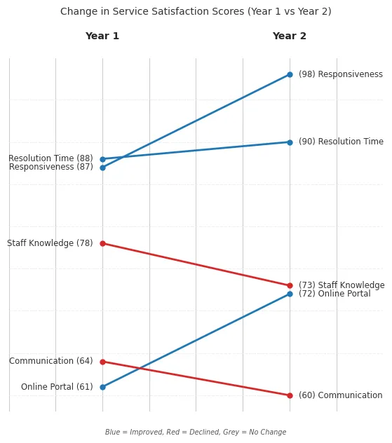 Purpose: Directly comparing the change in value or rank for multiple categories between two points in time or states. It excels at showing relative shifts.
Client Scenario: Visualizing the change in customer satisfaction ratings for various service aspects between last year’s survey and this year’s survey. The focus is on which aspects improved or declined the most.
Implementation: (Slopegraphs require more manual positioning in matplotlib)
# --- Technique 6: Slopegraph ---
np.random.seed(303)
categories = ['Responsiveness', 'Resolution Time', 'Staff Knowledge', 'Online Portal', 'Communication']
year1_score = np.random.randint(60, 90, size=len(categories))
# Simulate some change
year2_score = year1_score + np.random.randint(-10, 15, size=len(categories))
year2_score = np.clip(year2_score, 50, 100) # Keep scores reasonable

x_coords = [0, 1] # Two points in time

fig, ax = plt.subplots(figsize=(6, 7))

# Plot lines connecting the points
for i in range(len(categories)):
    color = '#1f77b4' if year2_score[i] > year1_score[i] else ('#d62728' if year2_score[i] < year1_score[i] else '#cccccc')
    linewidth = 2 if color != '#cccccc' else 1.5
    ax.plot(x_coords, [year1_score[i], year2_score[i]], marker='o', markersize=5, color=color, linewidth=linewidth)

    # Add text labels next to points
    ax.text(x_coords[0] - 0.05, year1_score[i], f'{categories[i]} ({year1_score[i]})', ha='right', va='center', fontsize='small', color='#333333')
    ax.text(x_coords[1] + 0.05, year2_score[i], f'({year2_score[i]}) {categories[i]}', ha='left', va='center', fontsize='small', color='#333333')

# Styling and Axes
ax.spines['top'].set_visible(False)
ax.spines['right'].set_visible(False)
ax.spines['left'].set_visible(False)
ax.spines['bottom'].set_visible(False)
ax.yaxis.grid(True, color='#eeeeee', linestyle='--')
ax.tick_params(left=False, bottom=False, labelleft=False, labelbottom=False) # Hide axis ticks and labels

# Add Year labels at top/bottom
ax.text(x_coords[0], ax.get_ylim()[1]*1.02 , 'Year 1', ha='center', va='bottom', fontsize='medium', fontweight='bold')
ax.text(x_coords[1], ax.get_ylim()[1]*1.02, 'Year 2', ha='center', va='bottom', fontsize='medium', fontweight='bold')

# Set limits carefully to give space for labels
ax.set_xlim(x_coords[0] - 0.5, x_coords[1] + 0.5)
ax.set_title("Change in Service Satisfaction Scores (Year 1 vs Year 2)", pad=45)
# ax.set_ylabel("Satisfaction Score (Scale 0-100)") # Still good practice even if axis is hidden

# Optional: Add subtle indicator legend for color meaning
ax.text(0.5, ax.get_ylim()[0] - (ax.get_ylim()[1] - ax.get_ylim()[0]) * 0.05, # Place below bottom margin
        'Blue = Improved, Red = Declined, Grey = No Change',
        ha='center', va='top', fontsize='x-small', color='#555555', style='italic')

plt.tight_layout(rect=[0, 0.03, 1, 0.95]) # Adjust rect to make space for legend
plt.show()
Design Choices & Communication:
- Direct Comparison: The core strength is showing the change directly via the line’s slope and direction.
- Minimalist Axes: Axes are typically minimized or removed, with labels placed directly next to the data points. This reduces clutter and focuses attention on the connections.
- Focus (Color): Color is used strategically to indicate the direction of change (e.g., blue for increase, red for decrease, grey for no change), instantly highlighting improvements and declines.
- Clarity: Requires careful label placement to avoid overlap. Best suited for a moderate number of categories. This addresses the need to clearly see relative shifts between two specific states.
Overarching Best Practices
Regardless of the specific technique:
- Start with Context: Always clarify who the audience is and what you need them to know or do before choosing a visual.
- Declutter Ruthlessly: Remove gridlines, borders, redundant labels, unnecessary precision, and background elements that don’t add information.
- Focus Attention: Use color, size, placement, and annotations deliberately to guide your audience’s eye to the most important parts of the data.
- Choose Wisely: Select graph types appropriate for the data relationship (comparison, trend, distribution, part-to-whole, relationship). Avoid chart types Knaflic warns against (pie, donut, 3D).
- Iterate & Seek Feedback: Good visualizations rarely happen on the first try. Sketch ideas, refine designs, and get a fresh perspective from a colleague or intended audience member.
Conclusion
Mastering data visualization is a journey that blends technical skill with communication artistry. By applying the principles championed by “Storytelling with Data” and leveraging the power and flexibility of tools like matplotlib, we can create visualizations that don’t just show data, but effectively communicate insights, drive understanding, and empower decision-making for our clients. Remember that the goal isn’t just a pretty chart, but a clear, compelling story told through data. Practice these techniques, always keep your audience in mind, and strive for clarity above all else.
The link uses amazon affiliate links and buying the book through the link gives certain commission.